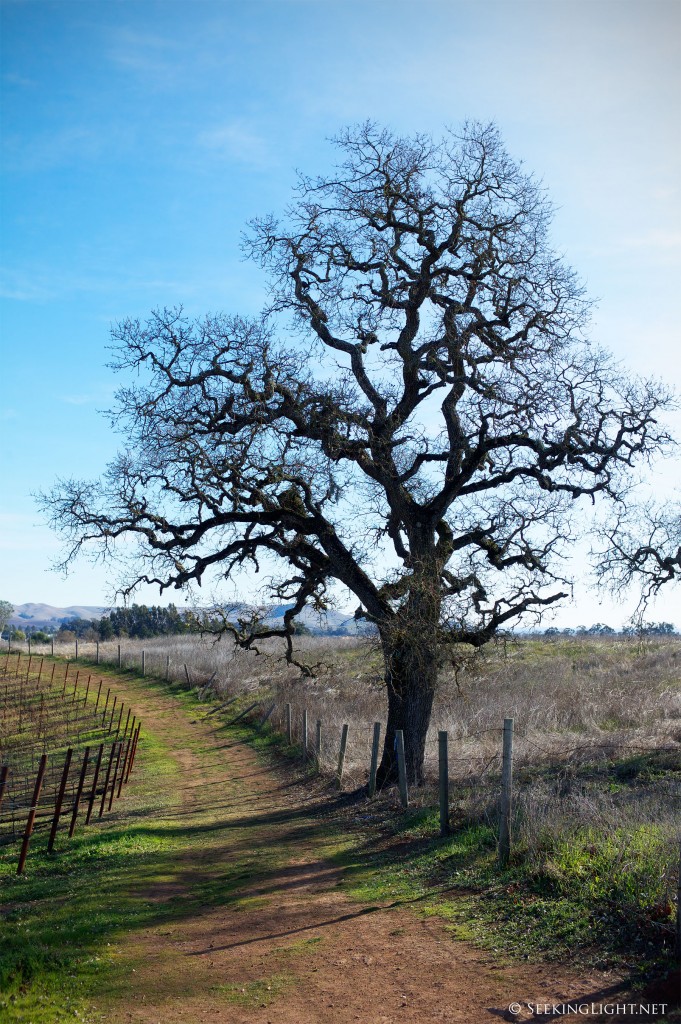
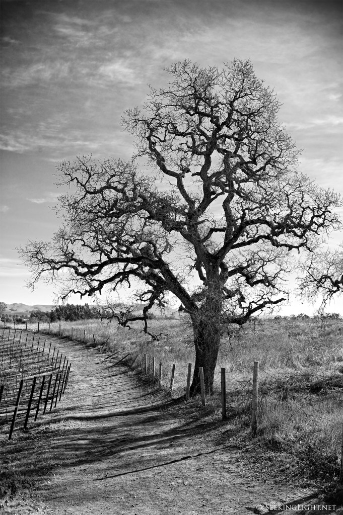
I made this image on a recent trip to Napa, California. I had processed this on my laptop and posted it previously here.
LCD screens on laptops are not very easy to calibrate. The angle of the screen also makes a big difference to how one perceives the image. A kind reader, Calvin, had pointed out in the previous post that the monochrome version lacked contrast, and he is right. After getting home I decided to reprocess the image on my calibrated setup at home and here are the results. I think both images are improved – the color version marginally so and the monochrome version significantly. Your thoughts?
Clicking on the image will open up a larger image, for your viewing pleasure:


Love the images both in color and B&W Raaj!
Thanks, Dave!
Though both images look good… considering main object “A Bare tree” I prefer the monochrome version
Keerthi! Good to hear from you and glad you visited. How are things with you? Shooting these days?
Raaj, both of these photos are really stunning!